|
Templates - Navigation
|   |
The navigation tab contains parameters that affect the appearance of the navigation (i.e., forward and back) buttons that are shown to respondents when taking a survey.
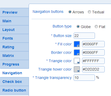
- Navigation buttons
Determines the types of buttons to use.
Arrows: graphical buttons with no text. Example: 
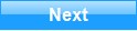
Textual: rectangular button with text. Example: 
See also Survey List - Messages to customize the text shown in the buttons.
See below for the parameters for these navigation buttons.
- Button type (arrow type): The type of button to use.
Example:
Globe
 Flat
Flat
- Button size (arrow type): The size in pixel for the navigations buttons
- Fill color (arrow type): The dominant color for the buttons
- Fill color 2 (arrow type): For flat buttons, the combination of Fill color and Fill color 2 defines a color gradient for the button. Fill color controls the color at the bottom left corner of the button and Fill color 2 controls the color at the top right corner of the button.
Fill color 2 is not available for Globe buttons.
Example:
Fill color blue and Fill color 2 yellow
- Border color (arrow type): The color of the border around the button.
To make it appear that there is no border around the buttons, choose the color that correspond to the background of the question area.
- Triangle color (arrow type): The color of the triangle in the button.
- Triangle hover color (arrow type): The color of the triangle in the button when the mouse cursor is placed over the triangle.
- Triangle transparency (arrow type): The transparency of the triangle in the button. A value of 0% corresponds to an opaque triangle. A value of 100% corresponds to a perfectly transparent triangle. When the triangle is partially transparent, the color of the triangle is a blend of the chosen Triangle color and of the color behind the triangle.
Example:
 0%
0%
 50%
50%
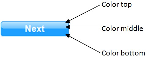
- Bottom, Middle, and Top color (textual type): The colors for the button. In addition, the color of the border for the button can be set.
- Text font (textual type): The font to use for the text in the button and the color of the text in the button.
Example:
font size 12
 font size 10
- Highlighted text color (textual type): The color of the text in the button when the cursor is over the button.
Example:
 highlighted text color: #0066AA
- Vertical and Horizontal padding (textual type): The padding in pixel vertically and horizontally around the text for the button.
Example:
vertical padding: 4 -- horizontal padding: 25
 vertical padding: 7 -- horizontal padding: 18
- Corner radius (textual type): The radius of curvature for the corners in the button.
Example:
corner radius: 12
 corner radius: 0