Novi Survey Home
|
Templates - Check box
|   |
The check box tab contains parameters that affect the appearance of check boxes that are shown to participants when taking a survey.
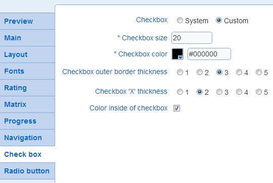
- Check box size: Determines the size of the check box in pixels.
Example:
 : size 20
 : size 35
- Checkbox color: Determines the color of the check box.
- Check box outer border thickness: Determines the thickness in pixels of the line delimitating the checkbox
Example:
: thickness 3
 : thickness 5
- Check box 'X' thickness: Determines the thickness of the 'X' shown inside the check box when it is selected. In general, it is advisable to keep this setting at a value lower than the thickness of the outer border (see above).
Example:
 : thickness 2
 : thickness 4
- Color inside of check box
Determines if the inside of the check box has color or if it is transparent. If the check box inside is transparent, the color of the background for the survey will show through the check box.
Example:
with color inside the check box
 without color inside the check box