|
Templates - Layout
|   |
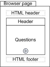
The layout tab defines the structure of the template. The major areas in a template are shown in the figure below. Specific fields in the layout tab act affect the visual appearance of these areas.
- Logo: The image for the logo to display in the header of the survey
- Logo alignment: The alignment of the logo, if any, in the header of the survey.
Option position with title controls the vertical position of the logo relative to the vertical position of the title for the survey. If the option is not set, the logo is shown above the title. If the option is set the logo is at the same vertical position as the title.
Example:
Position with title not set

Position with title set

- Survey name alignment: The position of the survey name relative to the header area for the survey
- Page title alignment: The position of the page title relative to the question area for the survey. The page title is shown at the top of the question area for each page in the survey.
- Survey name & logo display: Controls if the survey name and template logo are shown to respondents.
- Survey alignment: The position of the survey (i.e., header and question areas) relative to the browser page.
- Total width, Full browser width: The total width sets the width in pixels for the header and question areas. If option 'Full browser width' is selected, the survey layout will scale to occupy the full width of the browser window. However, the margins set for the page will still be honored even when this option is selected. The 'Full browser width' option is useful when designing survey for mobile devices where it is often desirable to use the entire real estate available on the device.
- Preferred question width: The preferred width in pixels for questions. This setting applies to multiple choice and to matrix questions only. The option can be used to ensure consistent width for questions with a tabular layout throughout the survey.
- Page margins: The minimum margin between the edge of the browser frame and the area displaying the survey (i.e., the minimum margin around the survey). The margins can be set independently for the top, right, bottom, and left side of the browser.
- Survey region margin: The margin in pixel for the header and question areas. The margin specified is set on all fours side (top, right, bottom, left) of the header and of the question area.
- Spacing between questions: The vertical spacing in pixel between questions. The greater the spacing, the more white space will be shown between questions.
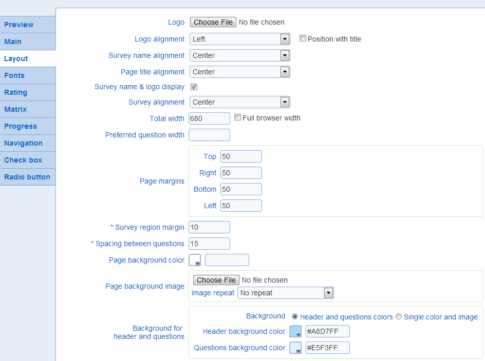
- Page background color: The background color for the browser page.
- Page background image, Image repeat: The image to use as the background for the page in the browser. The 'Image repeat' option specifies if the image is repeated along the horizontal or vertical dimensions in the page. The page image can be used in conjunction with the page background color to achieve full coverage of the page for any sizing of the browser.
- Background for header and questions: The background for the header and the question area can be set either as solid independent colors or as a combine color and background image. When the color and image option is selected the header and question area is treated as single display area in the page for the purpose of setting the background.
Header and questions color:
Header background color: The background color for the header area.
Question background color: The background color for the question page.
Single color and image:
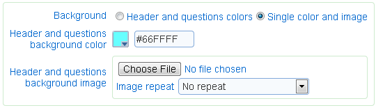
Header and questions background color: The color to use for the background of the combined header and question areas.
Header and questions background image, Image repeat: The image to use for the background of the combined header and questions areas. The repeat of the image along the vertical and horizontal dimensions is determined by option 'Image repeat'
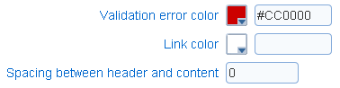
- Validation error color: The color for validation errors displayed to respondents.
- Link Color: The color of links embedded in the survey or the completion page.
- Spacing between header and content: The separation in pixel between the header and question areas.
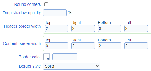
The question and header area may be either surrounded by a border or have rounded corners. These areas cannot have both rounded corners and a border.
- Round corners: Specifies if the corner of the question and header areas should be rounded. If the spacing between the header and question area is zero then the header and question area will be treated as a single rectangle with 4 corners. If the spacing if greater than zero, the header and the question area will be treated as a rectangle each (i.e., 2 rectangles with a total of 8 corners). The rounding of the corners applies to each of the rectangles for the header and the questions (either 1 or 2 rectangles). This option should not be selected when a image is used for the background of the header and question areas (see 'Single color and image' above).
- Corners to round: The corners of the header and question areas that should be rounded. This option is available only when the option round corner is set.
- Corner radius: The radius for the rounder corners in the header and question areas.
Examples:
radius 12 
radius 20 
- Drop shadow opacity: The opacity of the shadow around the header and question areas. Opacity of 100% corresponds to a black shadow, opacity of 0% corresponds to no shadow. The option is available only if option Round corners is not set.
Examples:
0% opacity 
50% opacity 
100% opacity 
- Header border width: The width in pixel of the border around the header area. The option is available only if option Round corners is not set.
- Content border width: The width in pixel of the border around the question area. The option is available only if option Round corners is not set.
- Border color: The color of the border around the question area. The option is available only if option Round corners is not set.
- Border style: The type of the border around the question area. The option is available only if option Round corners is not set.
- Marker for required questions: Specifies if and how required questions are identified visually to the participant.
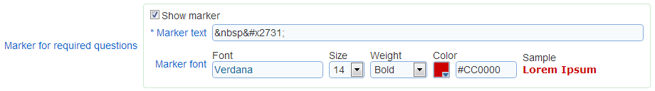
The options available are:
Show marker: specifies if required questions are identified
Marker text: the text to add at the end of the question to designate it as required. By default, an asterisk character  is used.
Marker font: the font for the marker text
Size: the size for the marker text. The size should equal or smaller than the size of the font for the question text to avoid offsets in the positioning of the question title.
Weight: the weight for the marker text
Color: the color for the marker text
- Prevent zooming (mobile): Specifies if zooming is allowed when accessing the survey from a mobile device. If zooming is allowed, standard zooming gestures will be honored. If zooming is not allowed, all zooming gestures will be ignored and the appearance of the survey will remain the same.
- Disable browser spell checker: If this option is set, text fields include instructions to the browser to not spell check their content.
- Custom CSS: Specifies Cascading Style Sheet instructions for the survey. The instructions will be loaded into each page for the survey after the standard styling instructions defined by the other fields in the template. The CSS is presumed to be syntactically correct. No validation is performed on the custom CSS. Syntactically incorrect CSS instructions may result in unwanted appearance changes to surveys and may interfere with the standard styling of surveys. Custom CSS instructions should be defined without script tags.